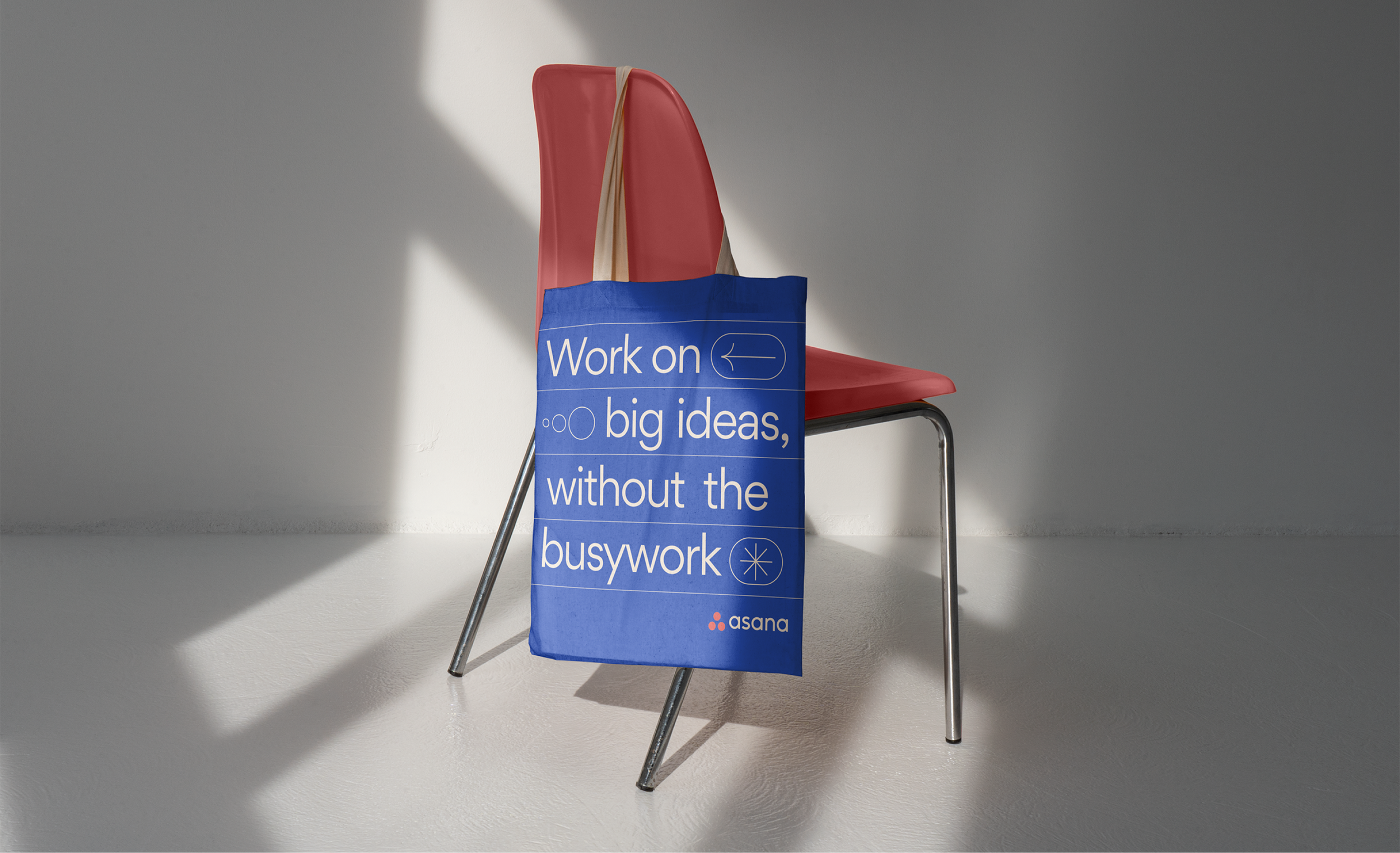
Asana Rebrand 2022
Toward the end of my time at Asana, our team kicked off an internally-led rebrand. As Asana scaled globally, it was clear that the company had outgrown their brand.
Asana saw this as an opportunity to continue to differentiate in the space, celebrate their customers, and double-down on their core message, “Asana allows you focus on the work that you love.” With this in mind, we focused on creating a brand that would support an aspirational vision of work.
Branding, Art Direction, Asset Library Creation
Brief
We kicked off the process with a hefty internal audit. We used our findings to identify the areas of the visual identity that needed the most attention.
We decided to overhaul illustration as it was a quick win for differentiation. Additionally, introducing a new photo library would allow us to celebrate customers and showcase work in an aspirational light. Lastly, we dug into the asana color palette and usage.
The Pitch:
We pitched several rounds of photography and illustration while developing color palettes. We landed on photography that felt authentic while elevated. We chose an illustration direction that allowed us to discuss work thematically as opposed to literally, enabling more artfulness in final executions.


